


In the current digital era, it is crucial to develop a visually enticing and functional website. With the increasing number of devices and screen sizes, ensuring that your website looks and performs well across different platforms is essential. Responsive website design testing tools significantly achieve this goal by enabling developers to test their websites simultaneously on various devices and screen sizes.
This article will explore nine of the best responsive website design testing tools to help streamline your website development process.
A website with a design that is responsive will adjust itself to fit any screen size. It eliminates the need to create and maintain two distinct versions of your website and is equally simple to create and use on mobile devices, tablets, and desktop computers.
The responsive website will change to fit when viewed on mobile devices with different screen sizes. This means it looks great on phones, tablets, and computers of various screen sizes. This eliminates the need for the user to double-tap or pinch the screen to zoom in on the page, or to scroll horizontally, on a smartphone or other small-screen device. The layouts can be adjusted to the size of the screen and altered to improve readability.
Since it is easier for users to interact with, share, and link to websites created with a responsive design, those websites are also more user-friendly. These steps are made more difficult by the existence of different desktop, tablet and mobile screen sizes, which, as previously indicated, can also lead to confusion. This may cause users to leave your website in favour of your competitors, who offer a more streamlined and user-friendly experience.
To make a website responsive, additional code must be added to the existing site. It provides directives and performance parameters to initiate layout changes and make them fluid. On various devices, users are presented with the identical version of the website created in this manner; the information, however, has been altered and reorganized to improve viewability.
When creating a new, responsive website, it is advised that the mobile-first approach should be implemented. This means that the initial layout should be designed to appear good on a small screen, and once the design is completed, CSS media queries, the meta viewport tag, and breakpoints should be added to responsive design tests to scale them up when viewed on a large screen device.
The responsiveness of your theme, while using WordPress can be determined by evaluating your website on various devices or by utilizing Google’s mobile-friendly test. Consider switching to a more modern theme if you discover that your current one is not responsive. As a bonus, this may also help your website rise in the natural search engine rankings and provide a better experience for your visitors.
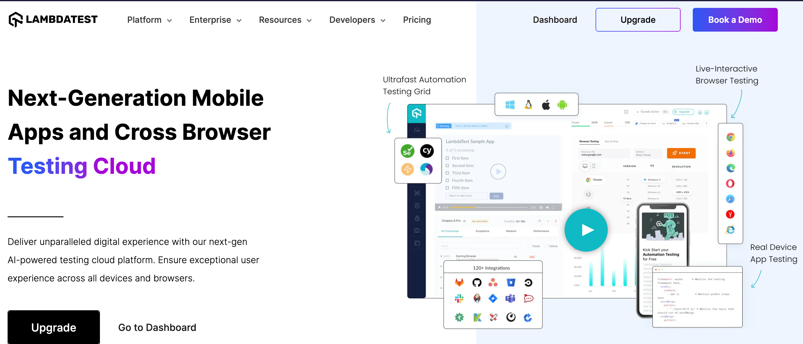
LambdaTest is a popular cloud-based testing platform that allows you to test your app or website’s responsiveness on over 2,000 real browsers and operating systems. It provides a user-friendly interface and offers numerous features like live interactive testing, automated screenshot testing, and responsive testing. With LambdaTest, you can easily identify and fix any design or page layout issues across different devices and browsers, ensuring a seamless user experience.

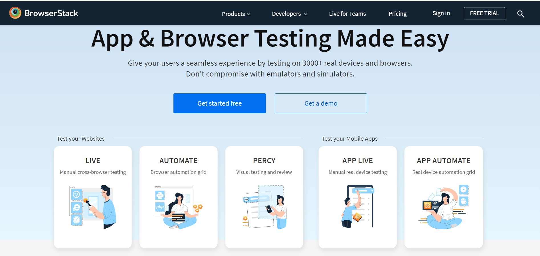
BrowserStack is another widely used cloud-based responsive testing tool that offers a vast range of real devices and browsers for testing responsive designs. It enables you to evaluate your website on mobile browsers and desktops, such as iOS and Android. BrowserStack provides users with a robust debugging environment, live testing, and the ability to capture screenshots. Its extensive feature allows you to quickly find and fix problems with responsive design.
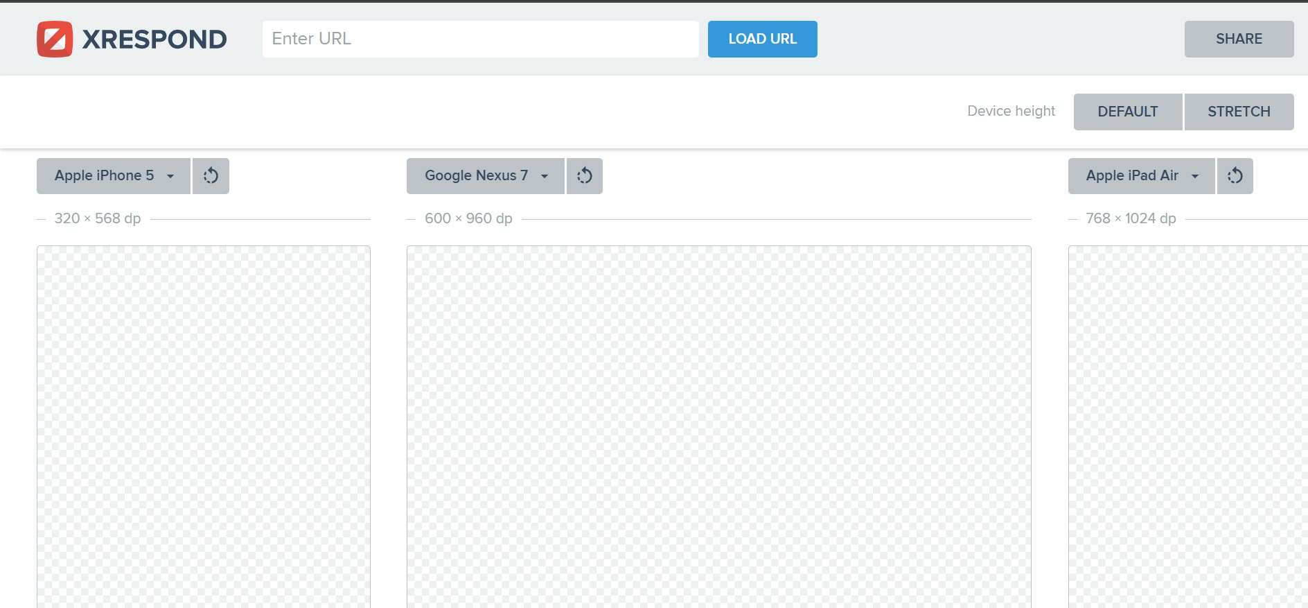
Xrespond is a handy responsive web design testing tool that provides a quick and easy way to check how your website appears on different screen sizes. It allows you to input the URL of your website and view it instantly on multiple device sizes. Xrespond offers a simple and intuitive interface, making it ideal for developers and other site designers looking for a hassle-free responsive web design testing tool.

Smartbear Cross Browser Testing is a powerful cross-browser testing platform that offers responsive design testing capabilities. It provides access to real devices, browsers, and operating systems optimized for testing your website’s responsiveness. With its interactive live testing and automated screenshot functionality, you can ensure that your website’s elements look and function seamlessly on various devices and screen sizes.
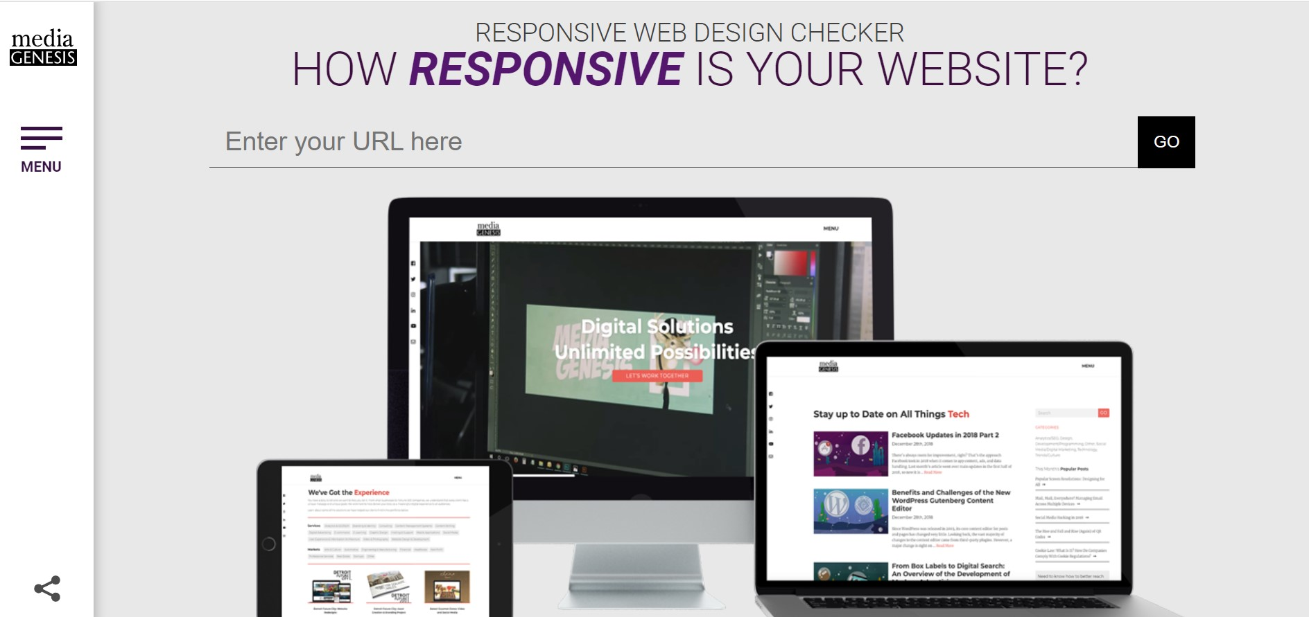
Use the free online tool Responsive Web Design Checker to evaluate your website on various device sizes and check whether it is responsive on mobile. It has an easy-to-use interface in which you can enter the URL of your website and select from a variety of device possibilities. Responsive Web Design Checker enables you to make successful responsive tests, quickly identify any responsive design issues and make your site with the necessary adjustments for optimal user experience.

Designmodo Responsive Test is a convenient tool that lets you preview your website on different device sizes and resolutions. It offers a drag-and-drop interface, allowing you to test your website on the desktop side’s responsiveness by simply uploading your site’s files. Designmodo Responsive Test offers several tests that are already set up for different screen sizes and device orientations. This helps you make sure that your website works well on different screen sizes.
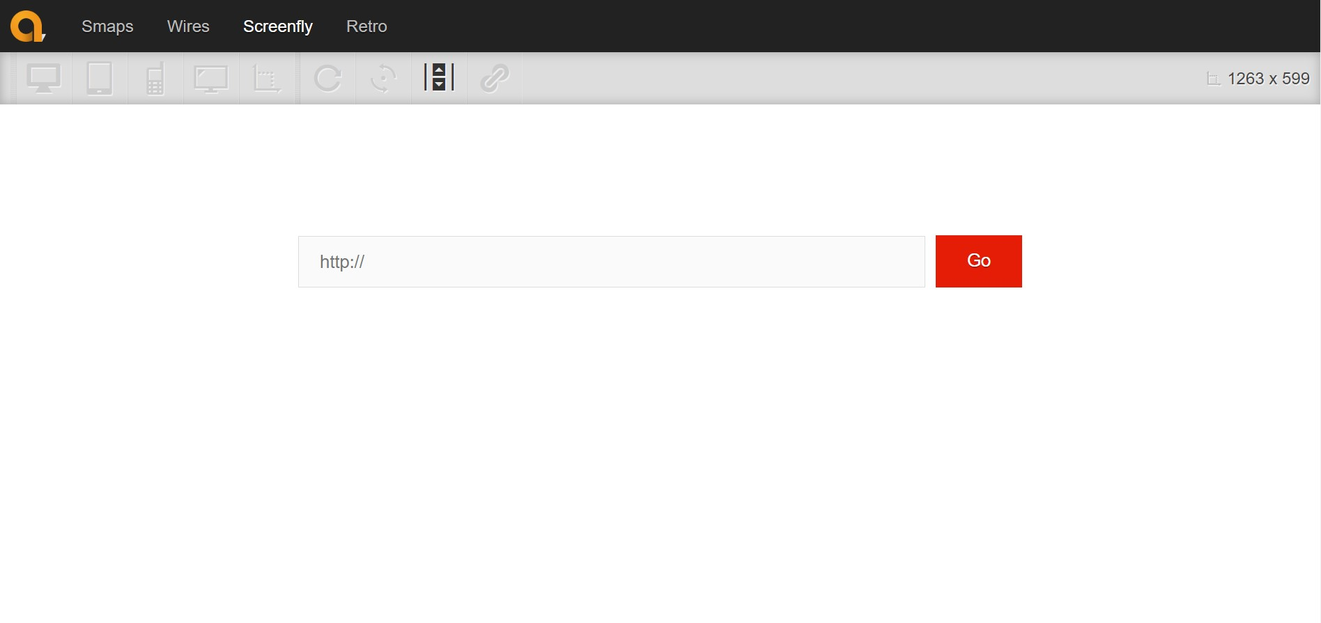
Screenfly is a fully responsive web design testing tool developed by QuirkTools. It allows you to test your website’s responsiveness by selecting various device sizes, including desktops, tablets, and smartphones. Screenfly provides a real-time preview of your website on different screen sizes, enabling you to make informed design decisions. Additionally, it offers a bookmarklet for quick access and easy testing of screen size during the development phase of responsive web design.
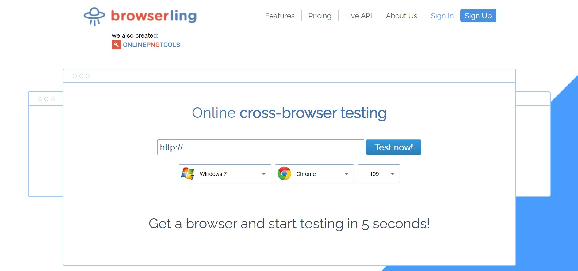
Browserling is a versatile browser testing tool that supports responsive design testing. It offers a wide range of real browsers for testing your website’s responsiveness and compatibility. Browserling allows you to manually adjust the browser size of test websites, or choose from preset device and browser sizes to see how your website adapts. With its intuitive interface and powerful features, Browserling simplifies the process of doing responsive web design testing.
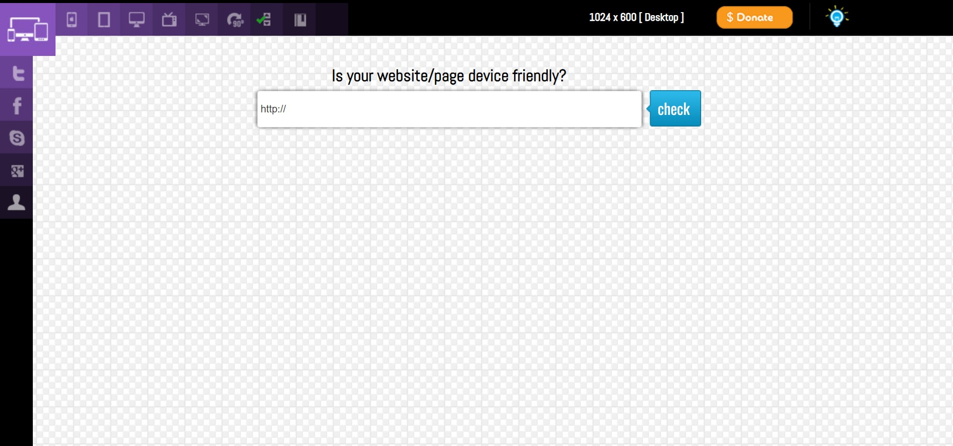
Responsive Test Tool is a lightweight, browser-based tool that allows you to test your website’s responsiveness on different screen sizes. It offers an easy user interface in which you can enter the URL of your website and select from a variety of screen sizes for various devices. Responsive Test Tool instantly displays an image preview on your website, allowing you to evaluate its responsiveness on preset screen sizes and make necessary adjustments.
Multiple screens are a part of our daily lives. As a result, your website must be accessible on as many devices as possible, as you never know which device a visitor will be using to view it.
According to statistics, responsive websites are just as important as desktop websites. There are already more mobile viewers than desktop users, and that ratio is only expected to increase as more people gain access to smartphones.
The mobile-friendliness of various elements of a website was also announced to be a ranking component in Google’s search algorithms in early 2015. Mobile-friendly sites can fall in search engine rankings since they couldn’t provide a satisfactory experience for mobile users.
In conclusion, the advantages of responsive website and web design include:
In today’s digital landscape, responsive website design is essential for delivering a seamless user experience across multiple devices and screen sizes. Utilizing the right, responsive web designs and website design testing tools ensure that your website looks and functions flawlessly on various platforms and tablets.
The nine tools mentioned in this article—LambdaTest, BrowserStack, Xrespond, Smartbear, Responsive Design Checker, Designmodo Responsive Test, Screenfly, Browserling, and Responsive Test Tool—offer a range of features to simplify the responsive testing process. From live testing on real devices to automated tests with screenshot capture and responsive design previews, these tools enable developers and designers to identify and resolve responsive design issues efficiently.
Remember, testing your website’s responsiveness is an ongoing process. As technology evolves and new devices enter the market, it’s crucial to stay updated and ensure that your website remains responsive and user-friendly across all platforms. By incorporating these responsive website tests and design testing software tools into your web development workflow, you can enhance the quality of your websites and deliver exceptional user experiences.
So, start exploring these tools, experiment with different screen sizes, and scale and optimize your website’s responsiveness to captivate your audience and achieve your business goals. Happy testing!


2026 © | Ectesso Digital Agency


 Call Now
 WhatsApp

