


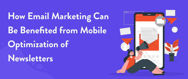
In the busy digital world of today, where smartphones have become an essential part of our lives, mobile email newsletters have become a powerful way to reach people on the go. Millions of people now use their phones as a source of information as their primary method of contact and information. This means that companies and content creators need to make sure their email newsletters work well on email platforms in mobile. Organizations can get the most out of their mobile email newsletters and strengthen their connections with their target audiences by adapting the content, design, and user experience as a whole to the specific capabilities and limits of mobile devices.
Mobile newsletter optimization is more than just resizing the emails to fit smaller mobile screens. It takes a strategic understanding of how users act, the use of responsive design principles, and a strong focus on providing useful, short content. Now let’s discuss the best practices to optimize mobile newsletters. This will help you hook your readers, get them involved, and reach your communication goals.

A newsletter is a way for businesses to share useful and important information with a community of customers, potential clients, and subscribers. Newsletters provide you with direct access to the inboxes of your target audience, allowing you to offer intriguing information, promote sales, and ultimately generate traffic to your site.
In addition, email marketing campaigns are easier to measure, which enables you to keep track of your ROI and make adjustments for improved performance.

If you want people to open and read your newsletter, it has to be interesting and not just an attempt to sell them something. If the subject line of an email is meant to inform or amuse the receiver, it is much more likely that they will open it. Hence it is the responsibility of the business to choose intriguing subjects and content for the newsletters for mobile-friendly email marketing.
Newsletters give online companies a chance to show how trustworthy their products are. It offers your customers and followers information about your brand. Create a story that puts your brand in the spotlight and gives readers a reason to trust you. Loyal customers spend 23% more than average customers, and newsletters are a great way to stand out from the competition and keep these customers coming back for more.
The plan is to have 90% information and 10% advertising in newsletters. If the percentage is maintained, the informative content will bring in more sales than the copy that sells the product.

Digital marketing would not be the same without mobile-friendly email marketing. However, with the advancement of technology, it’s become more crucial than ever for companies to modify their own designs and marketing plans to stay up with shifting consumer preferences. Mobile optimization is one such upgrade.
The rise in mobile use has changed a lot about how people get information and interact with it. Recent statistics show that mobile devices account for more than half of all web traffic worldwide. This means that businesses need to change their strategies to cater to the mobile experiences and communication models that satisfy their prospective customers.
This tendency will probably only intensify as phones are increasingly being used to check email. It’s critical that companies ensure that their email promotions are mobile-friendly as well as desktop-friendly.
Mobile-friendly newsletters can greatly help email marketing. Optimized newsletters for mobile devices look great, and mobile-friendly emails are easy to read. You can increase the effect of email marketing with this easy change.
Here’s why it’s important to optimize for mobile:
Newsletters that are optimized for mobile phones are made to fit the screens of phones and tablets, making them easier to read and browse. This makes the whole user experience better and also raises the possibility that users will interact with the content you provide.
It is more likely that people will open their email newsletters that are designed for mobile.
Mobile optimization makes sure that links, buttons, and calls to action are easy to tap on touchscreen devices. This makes it more likely that people will connect with your content and visit your website, which leads to a higher click-through rate.
Your brand’s image will be improved if your email newsletters are well-designed to match the requirements of mobile phone users. It shows that you care about giving your audience a smooth experience, which builds a better brand image and trust.
For mobile optimization, you need to use techniques for responsive design that instantly change the layout of the newsletter depending on the size of the screen. This makes sure that your content looks great on devices like smartphones, tablets etc.
Often, users give up newsletters that are hard to read or poorly formatted on mobile devices. Mobile optimization stops this from happening by making reading easy and user-friendly.
As more people use their phones to check email, mobile optimization of newsletters helps you reach more of your audience, making your email marketing efforts more effective.

An excellent user experience is crucial in email marketing, especially when it comes to newsletters. If your newsletters are hard to read or browse on a mobile device, people will probably lose interest quickly and move on. Un-optimized newsletters can cause a variety of issues, including long load times, poor readability, strange formatting, and broken links. The user experience and engagement could be significantly impacted by these problems.
Regular testing and updates on optimizing newsletters can help you keep your credibility as a sender and keep up with changes in the email industry. Hence if you don’t optimize these newsletters for mobile users, conversions will go down, and you’ll miss out on chances to make a lasting impact with most mobile users.
You can try out various optimization techniques such as responsive design layouts, streamlined content, mobile display strategies, and effective call-to-action implementation. By embracing these strategies, you can ensure that your mobile newsletters are not only visually appealing but also seamless and user-friendly, encouraging readers to stay engaged, click through to your website, and take desired actions.

Creating newsletters with responsive design techniques to ensure they adapt seamlessly to mobile displays, different screen resolutions and sizes. A responsive layout guarantees that your content with a design that works on all screen sizes, screen resolutions and devices, enhancing the user experience.
Consider the following points when you create a responsive design for a responsive email design or newsletter:
A single-column layout is a best practice to simplify the newsletter for mobile design. It eliminates the need for two columns for horizontal scrolling, ensuring your content fits within the mobile layout.
Choose an appropriate font size that is legible on smaller screens, which is typically around 14-16 pixels for body text. Ensure your headlines and calls-to-action are more prominent for better readability on small screen sizes, and avoid using tiny text in such sections.
Increase the size of buttons and links to accommodate touch interactions, minimizing the chances of accidental clicks or taps.

Make your subject lines compelling and concise to capture the attention of your readers. Mobile users often just skim through their emails, so your subject lines must be interesting enough to make them open your newsletter.
When crafting subject lines keep the following things in mind:
Limit subject lines to around 50 characters to ensure they are fully displayed on mobile devices.
Inspire readers to act by incorporating action verbs and clear calls to action.
Use personalization methods to make the subject lines of your emails more relevant and interesting to each recipient.

The pre-header text gives readers a sneak peek at what’s in your email, which makes them more likely to open it. Use this space to your advantage by writing a short recap or an interesting preview that goes with your subject line.
Make sure you keep these in mind when you’re optimizing pre-header text:
Aim for around 40-70 characters to ensure it displays effectively on mobile and desktop computers.
Expand upon the subject line’s message or introduce additional value to increase curiosity.
Showcase the most interesting elements of your email, like special deals, limited-time offers, or useful information. This helps bring attention to things that are important.

Make sure your information is formatted for the small screen of a mobile device. Users of mobile devices have short attention spans, so make sure to provide them with short, easy-to-read, and visually appealing content.
To optimize your content for mobile:
Make the content easy to read and understand by dividing it into sections. Taking in information and reading quickly will be easier if this is done.
Use eye-catching background images, infographics, or videos to increase interaction and share more information than you could with words alone.
Grab attention with clear and concise headlines that convey the essence of each section or article.

CTAs are very important for getting users to take action and make purchases. Make sure your CTAs are optimized for mobile devices by using clear, concise, and visually appealing buttons that stand out.
Follow these steps when designing mobile-friendly CTAs:
Use brief, action-oriented phrases that communicate the desired action.
Select colours that stand out against your newsletter’s background to make the CTA button visually distinct.
Avoid placing other elements too close to the CTA button, to make it look less busy and easier to read.
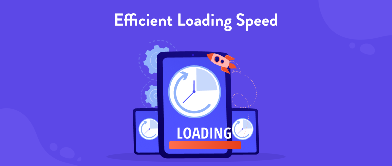
Mobile users expect fast-loading content. Slow-loading newsletters can lead to frustration and high bounce rates. Optimize your newsletter’s loading speed to ensure a seamless user experience.
To improve loading times and speed, consider implementing these steps:
Optimizing images can have a great impact on loading speed.
Loading times can be slowed down by removing unnecessary code and scripts.

Ensure that your newsletter’s opt-in and unsubscribe processes are mobile-friendly and easy to use. Simplify the steps required for subscribers to sign up and unsubscribe to maintain a positive user experience.
To optimize opt-in and unsubscribe processes:
Ensure that only essential information is collected on opt-in forms. Similarly, make the unsubscribe process hassle-free and easy to locate.
Add pre-populated fields or one-click confirmation links to simplify the opt-in process for mobile users.
Communicate the steps required to subscribe or unsubscribe by writing emails, and ensure, users can easily follow the process.

Keep testing and optimizing your mobile newsletters to make them more effective. Identify and implement improvements based on user behaviour, engagement metrics, and feedback.
When testing and optimizing:
Try out different subject lines, calls to action (CTAs), layouts and material to see what your audience likes best.
Keeping track of open rates, click-through rates, and conversion rates can help you improve your newsletters if they don’t meet the requirements.
Encourage readers to provide feedback on their mobile experience to gain more data and insights into their preferences and pain points.

Regularly updating your mobile newsletter strategy to stay relevant and meet evolving user expectations is the final tip.
Keep up with the best practices, recent trends, and case studies in mobile newsletter optimization.
Pay attention to user comments, social media interactions, and customer support inquiries to gather insights and identify areas for improvement.
Explore new technologies, tools, and platforms that can enhance your mobile newsletter strategy, such as Accelerated Mobile Pages(AMP) or Progressive Web Apps(PWA).
By using these best practices for optimizing the mobile version of newsletters, you’ll be able to make newsletters that are interesting and easy to use, which will resonate with your audience, increase click-through rates, and eventually lead to the actions and conversions you want. Continue to refine your mobile optimization based on feedback and statistics to improve your mobile newsletter strategy regularly.
An essential component of your email marketing plan should be tracking and evaluating the performance of the subscribers reading your mobile-optimized newsletters. Here are some measures you can take to monitor and evaluate the effectiveness of your mobile-friendly newsletters:
Several responsive email design and preview tools are available, allowing you to see how well your newsletter will appear on various devices. Before starting an email campaign to your audience, you can use these tools to identify any design or functionality issues.
You should always test your newsletter on actual mobile devices, even though preview tools can provide you with a good idea of how it will appear. In this way, you will be able to get a better idea of what your audience will see.
Ensure that all hyperlinks in the newsletters as well as the emails are operational and lead to the intended location.
Determine how long your newsletter takes to display on a mobile device. If your email is taking too slow to load, it may be time to look into optimizing it.
Consider requesting friends or coworkers to examine the newsletter on their respective mobile devices and provide suggestions and remarks. This is especially useful if the recipient uses a different device or app to read emails.
Set clear goals and KPIs at the start of your email campaigns and other marketing efforts. This would definitely help you concentrate on your goals and work accordingly.
The two most crucial metrics to monitor email marketing are open and click-through rates. These metrics will be used to assess how effectively your communications engage.
Tracking conversions can be used to analyze the success of your newsletters and email marketing. You can find out how many people opened your email, clicked on a link, and then made a purchase or filled out a form.
It is also essential to monitor engagement across multiple devices, such as mobile and desktop clients. You could then change your approach based on this information to learn more about the platforms your audience uses to read your emails.
The viability of your email program can be determined by the delivery and bounce rates. Your emails may be marked as spam if a low percentage of them are successfully delivered. If you have a lot of emails that don’t get opened, that could mean that your emails aren’t set up for different email apps and devices.
You may rest assured that your email subscribers will have the greatest possible experience when opening the newsletters and other messages on their mobile devices if you follow these guidelines. As the landscape of email marketing evolves, regular testing can help you adapt and optimize your email newsletters accordingly.
Mobile optimization is a key part of the success of newsletter marketing efforts and will help you get more subscribers. Since most customers use their phones and tablets to check their email, companies need to put the mobile experience first. Marketers can improve engagement, increase conversions, and build better relationships with their audience by using responsive newsletter design, optimizing templates, and taking into account the unique needs and habits of mobile users. Staying ahead of the curve with mobile optimization will be the key to getting the most out of email marketing in a world that is becoming more focused on mobile devices.


2026 © | Ectesso Digital Agency


 Call Now
 WhatsApp

